Using aggregated and raw data in the same visualisation

Parameter actions are a fairly new feature from Tableau 2019.2 and they are incredibly useful! They can be used in several ways. This article demonstrates how they can be used to switch between data sources.
For different reasons it can happen that we have an aggregate source and then several detailed sources giving more information about the aggregated elements. This can happen for example:
- If the detailed sources are very large and a pre-aggregated source is needed for performance.
- If the businesses providing the aggregated and detailed data are not the same and did not put in place a shared data structure
Here is an example from real life. To follow along you can use the Excel at this link.
We have 3 sources:
- The aggregated source contains project data from a Project Management tool. For each project we have:
- a column for committed costs (not yet spent)
- and one column for paid amounts.
- The PMO tool does not handle detailed receipts which have to be obtained from a financial application. Here we find fields as “Supplier” and “Receipt number”
- Finally, a source with the detail of the committed cost comes from yet one anther application. Here we can find fields as “Estimated time”
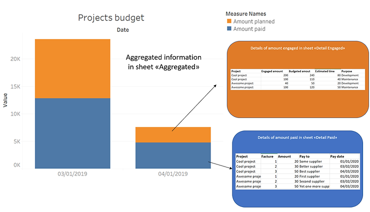
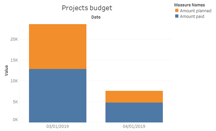
Now you can plot the 2 measures on a bar chart to find the total of your engaged and already spent cost. Put “Measure values” on the rows and “Measure names” on the colours (and remove Number of records and any unneeded measures.
Challenge: When you select a bar element you want to see the detail of the rows that lie behind.
This problem can be solved in several ways:
- Make a union of the 2 sources. This can hurt performance if the detailed sources are large, especially if they have very different fields. E.g. the receipts could have a whole of payment information that are not relevant for the Purchase Order.
- You could use blending. But this usually difficult to setup and maintain and hits performance.
- There is a third solution which I would like to propose using a filter action on the “Name of measures”
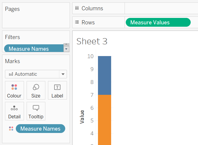
In order to produce your bar chart you put “Name of measures” on the colours and “Value of measures” on the axis
Now you can create a parameter to hold the value of the chosen measure
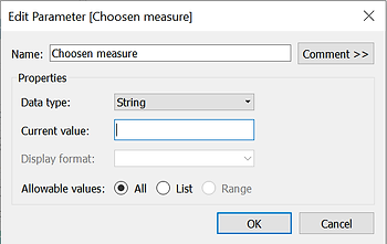
Leave the default value empty. If nothing is selected we do not want to see any detail. This parameter will be filled by the parameter action that we will setup on the dashboard.
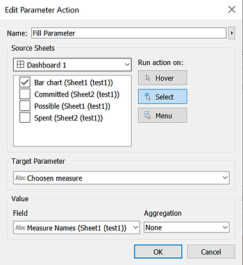
This action will fill the placeholder parameter with the value of the selected measure name.
Now we just have to create 2 tables with the detail. These can be completely different tables on different sheets. This is important as the user is probably interested in different columns in each case.
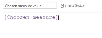
In order to show the correct table we can make 2 filters to hide the data when the parameter has the wrong value. To do this we can create a calculation just reporting the value of the parameter.
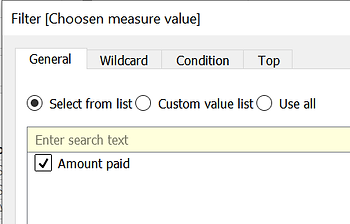
Now on each sheet you have to filter on this calculated field choosing the corresponding value. For example on the sheet holding the receipts (Amount paid) we will put a filter on the calculation being equal to “Amount paid”.
N.B.: To be able to select the correct value you have to change the parameter current value to what you need and then set the filter.
Voilà, enjoy your interactive dashboard!
Attention: Pay attention if your aggregate and detailed sources do not come from the same data flow. This can lead to discrepancies in their content.
Parameter actions are a fairly new feature from Tableau 2019.2 and they are incredibly useful! They can be used in several ways. This article demonstrates how they can be used to switch between data sources.
For different reasons it can happen that we have an aggregate source and then several detailed sources giving more information about the aggregated elements. This can happen for example:
- If the detailed sources are very large and a pre-aggregated source is needed for performance.
- If the businesses providing the aggregated and detailed data are not the same and did not put in place a shared data structure
Here is an example from real life. To follow along you can use the Excel at this link.
We have 3 sources:
- The aggregated source contains project data from a Project Management tool. For each project we have:
- a column for committed costs (not yet spent)
- and one column for paid amounts.
- The PMO tool does not handle detailed receipts which have to be obtained from a financial application. Here we find fields as “Supplier” and “Receipt number”
- Finally, a source with the detail of the committed cost comes from yet one anther application. Here we can find fields as “Estimated time”
Now you can plot the 2 measures on a bar chart to find the total of your engaged and already spent cost. Put “Measure values” on the rows and “Measure names” on the colours (and remove Number of records and any unneeded measures.
Challenge: When you select a bar element you want to see the detail of the rows that lie behind.
This problem can be solved in several ways:
- Make a union of the 2 sources. This can hurt performance if the detailed sources are large, especially if they have very different fields. E.g. the receipts could have a whole of payment information that are not relevant for the Purchase Order.
- You could use blending. But this usually difficult to setup and maintain and hits performance.
- There is a third solution which I would like to propose using a filter action on the “Name of measures”
In order to produce your bar chart you put “Name of measures” on the colours and “Value of measures” on the axis
Now you can create a parameter to hold the value of the chosen measure
Leave the default value empty. If nothing is selected we do not want to see any detail. This parameter will be filled by the parameter action that we will setup on the dashboard.
This action will fill the placeholder parameter with the value of the selected measure name.
Now we just have to create 2 tables with the detail. These can be completely different tables on different sheets. This is important as the user is probably interested in different columns in each case.
In order to show the correct table we can make 2 filters to hide the data when the parameter has the wrong value. To do this we can create a calculation just reporting the value of the parameter.
Now on each sheet you have to filter on this calculated field choosing the corresponding value. For example on the sheet holding the receipts (Amount paid) we will put a filter on the calculation being equal to “Amount paid”.
N.B.: To be able to select the correct value you have to change the parameter current value to what you need and then set the filter.
Voilà, enjoy your interactive dashboard!
Attention: Pay attention if your aggregate and detailed sources do not come from the same data flow. This can lead to discrepancies in their content.