Side by side bars on a date axis

The problem is to plot two bars side by side, based on two different measures, on a date(/time) axis. For each measure, the ‘date’ axis has the same value, so the out-of-the-box effect in tableau is to have piled up bars.
Here we consider a concrete scenario to show how to achieve side by side bars in such a scenario.
Dataset and requirements
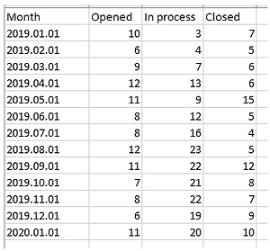
We have a dataset with the number of tickets open, closed, and in process each month.
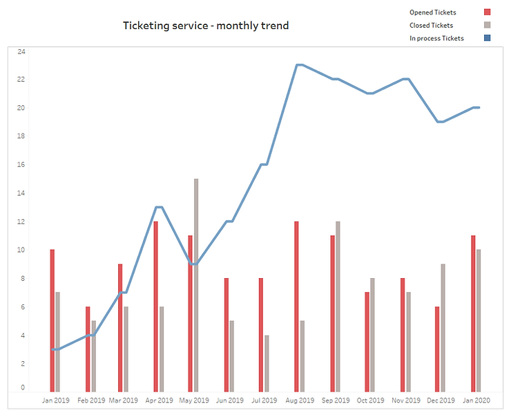
The goal is to show the following result in Tableau:
A first approach can be to bring ‘Measure Names’ to colour and ‘Measure Values’ to the row shelf, which will result in stacked bars.

Creating the side-by-side bar graph
In order to achieve the side-by-side configuration, we will modify our data source in the following manner:
1.
Create a union of the dataset with itself, i.e. repeat the dataset.
Attention : if you bring the same dataset into the data source pane, by default Tableau will try to create a "relationship" as signaled by the wiggly orange line shown below.
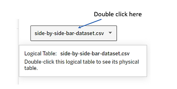
In order to create the union, you should double click on the dataset
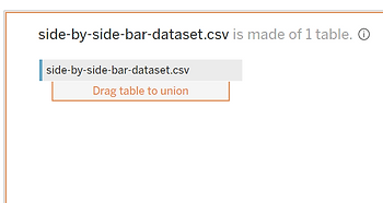
And then bring the same dataset into the pane once again. Keep holding the left click and hover just below the existing table and Tableau will show you where to drop the new table to create a union:
If you inspect the resulting dataset, you will will notice that tableau has created ‘Table Name’ and it keeps track of each table brought into the union. We will use this column to build some custom fields in the following.
2.
Create the following new fields in your tableau dataset. The 'nb days' is a parameter with an integer value, and its value is set to 5 for this example.
Variable Name : Date for axis
IF RIGHT ([Table Name],1) = '1' THEN DATEADD('day', [nb days], [Month]) ELSE [Month] ENDVariable Name : Closed Tickets
IF RIGHT ([Table Name],1) = '1' THEN 0 ELSE [Closed] ENDVariable Name : Opened Tickets
IF RIGHT ([Table Name],1) = '1' THEN [Opened] ELSE 0 ENDThe dataset will now look like:

3.
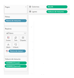
Bring the ‘Date for axis’ on the column shelf, measure values on the row shelf, and measure names to colour. Filter measure names to keep only ‘Opened Tickets’ and ‘Closed Tickets’. Make sure that the 'Date for axis' is set to continuous and its granularity is set to "day".
Then bring the measure "In process" to the row shelf, create a dual axis between "In process" and "Measure Values", align the two axes, and hide the second axis.
This will create the required bar chart:

The problem is to plot two bars side by side, based on two different measures, on a date(/time) axis. For each measure, the ‘date’ axis has the same value, so the out-of-the-box effect in tableau is to have piled up bars.
Here we consider a concrete scenario to show how to achieve side by side bars in such a scenario.
Dataset and requirements
We have a dataset with the number of tickets open, closed, and in process each month.
The goal is to show the following result in Tableau:
A first approach can be to bring ‘Measure Names’ to colour and ‘Measure Values’ to the row shelf, which will result in stacked bars.
Creating the side-by-side bar graph
In order to achieve the side-by-side configuration, we will modify our data source in the following manner:
1.
Create a union of the dataset with itself, i.e. repeat the dataset.
Attention : if you bring the same dataset into the data source pane, by default Tableau will try to create a "relationship" as signaled by the wiggly orange line shown below.
In order to create the union, you should double click on the dataset
And then bring the same dataset into the pane once again. Keep holding the left click and hover just below the existing table and Tableau will show you where to drop the new table to create a union:
If you inspect the resulting dataset, you will will notice that tableau has created ‘Table Name’ and it keeps track of each table brought into the union. We will use this column to build some custom fields in the following.
2.
Create the following new fields in your tableau dataset. The 'nb days' is a parameter with an integer value, and its value is set to 5 for this example.
Variable Name : Date for axis
IF RIGHT ([Table Name],1) = '1' THEN DATEADD('day', [nb days], [Month]) ELSE [Month] ENDVariable Name : Closed Tickets
IF RIGHT ([Table Name],1) = '1' THEN 0 ELSE [Closed] ENDVariable Name : Opened Tickets
IF RIGHT ([Table Name],1) = '1' THEN [Opened] ELSE 0 ENDThe dataset will now look like:
3.
Bring the ‘Date for axis’ on the column shelf, measure values on the row shelf, and measure names to colour. Filter measure names to keep only ‘Opened Tickets’ and ‘Closed Tickets’. Make sure that the 'Date for axis' is set to continuous and its granularity is set to "day".
Then bring the measure "In process" to the row shelf, create a dual axis between "In process" and "Measure Values", align the two axes, and hide the second axis.
This will create the required bar chart: