Performance Optimisation of Tableau Dashboard

Context
Performance optimisation is a highly common concern in various contexts. In the context of Tableau dashboards, it mainly concerns how much time is needed to do an initial load of the dashboard as well as the time spent waiting when interacting with the dashboard using filters, highlighters, etc. One of our clients with hundreds of dashboards, a large amount of Tableau Prep flows and various Tableau Server sites was running into severe performance issues across the board. The Prep flows were starting to take so much time to run that the server’s resources were starting to reach their limit and many dashboards were so slow that they were becoming impossible to practically use for the business. In order to start helping with these issues, Argusa’s help was requested to optimise a specific dashboard and present general best practices and advice on the topic.
Problem
The dashboard essentially consisted in a list of assets with their related performance metrics with visualisations of the top or bottom 20 performant ones. Various filters and parameters allowed to focus on specific dimensions or metrics. The data source was made of more than 200 fields, with almost a third of them being calculated fields, and more than 4 million rows. There was a large amount of duplication due to the way security was implemented, since the data was sensitive and could be accessed by different kinds of audience. We will expand on that later.
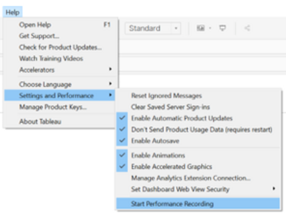
To measure the performance of the dashboard and have a systematic method to perform a comparison before and after our changes, we used Tableau’s handy feature called Performance Recorder.
We measured the time needed to modify two filters and one parameter as well as the initial loading time of the dashboard. The result was that it took 2min38s for the initial load and 78s to apply the modifications. Clearly, it is not the most pleasant dashboard to work with.
Solution
While there is a plethora of factors that can impact the performance of a dashboard, they can be aggregated in two main groups.
- Layout: The arrangement of the elements of a dashboard and the manner in which the underlying visualisations are built.
- Query: The data request and the manner in which the data source is built.
Layout Optimisation
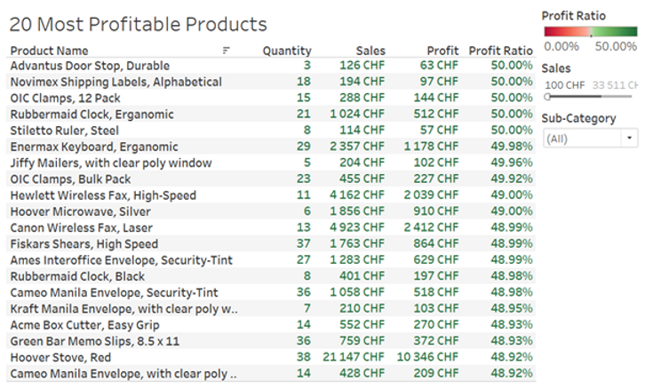
In order to illustrate the case, we have created hereafter a mock dashboard with a structure similar to that of the client. The idea is simply a list of the top 20 products with the highest profit ratio, with the possibility to filter on the type of product or the minimum sales value.
Now let’s dig into the details of how the underlying visualisation has been built.
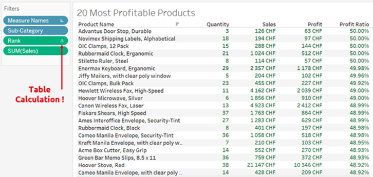
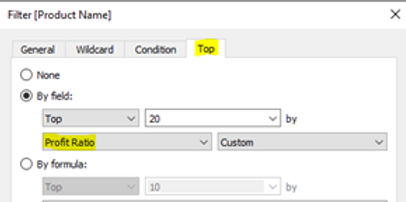
As we can see, in order to display the top 20 most profitable products a RANK() table calculation (as can be seen from the Δ symbol) was used. This means that Tableau needs to first load all the products, which in the case of our client corresponded to approximately 40’000 rows, in order to subsequently apply a ranking calculation which is then used as a filter to keep only the first 20. The exact same result can be achieved using a smarter way, as shown below.
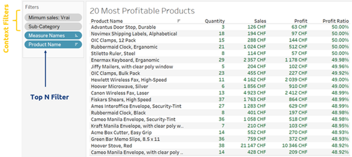
Here we used context filters on the categories and minimal sales in order to pre-filter the data. Additionally, we used a top N filter on the products. This is a much more efficient way to query the underlying data compared to table calculations, which are always applied last and thus require to load the entire table before filtering it.
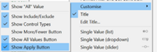
Another neat little trick is to use the option “Show Apply Button” on the multivalued filters of the dashboard as this allows to send a single request when performing a multi-select option.
The performance recording of the client’s dashboard before and after the modifications is shown hereafter.
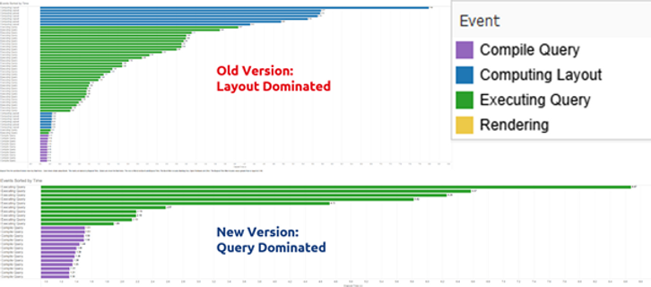
As can be seen, in the original version (top) the time was mainly spent on the layout while on the new version (bottom), time was spent on the query. Time due to the layout was 41.4s before and 1.9s after. Overall, the initial load time went from 2min38s to 2min18s while the interaction time went from 78s to 30s. This is quite impressive as the underlying data model and data source has not been modified whatsoever. Thus, we see that it is worth to give some thought to the way a visualisation is built and not just use the first solution that works.
General recommendations for the layout
Here is a list of general recommendations to improve the performance due to the layout computing.
- Table calculations are usually very slow as they are applied on the resulting view. They should be used as a last resort in case no other way to obtain the desired results is possible.
- If possible, it is best to avoid level of detail (LOD) calculations in favour of standard aggregations as the former are slower to compute.
- A clever use of context filters allows to reduce the amount of data that needs to be subsequently processed.
- In case of duplicated data, use MIN/MAX instead of AVG.
- Minimise the number of elements in a view/dashboard.
- Use the “Show Apply Button” on multi-select filters.
Query Optimisation
Most of the time, performance is mainly driven by the underlying query. This is only natural as the larger the data source the slower it will be to query it. Thus, it is good practice to design the data source with a minimalistic approach. The goal should be to create a data source with the least number of records/rows and dimensions, including calculated fields, that can provide the desired dashboard behaviour and functionalities.
General recommendations for the query
Here is a list of general recommendations to improve the performance due to the query.
- If possible, create a data source with only the required fields in it. Otherwise, hide un-used fields.
- Avoid the use of custom SQL as it limits Tableau’s ability to internally optimise the data request. Especially when sub-requests are present in the SQL query.
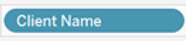
- Instead of using dummy calculated fields e.g., to change the display of the name of a field

such as [Client Name] = [People (People)] you can instead:
- Rename the field.
- Use an alias.
- Double click the field

and add “//<alias>”
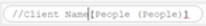
before the name of the field and press Shift+Enter .
This keeps the original name of the field in the data pane intact

- Avoid unnecessary LOD expressions.
- For joins the performance hierarchy goes as follows: INNER > LEFT/RIGHT > FULL.
- For data types the performance hierarchy goes as follows: Boolean > Float > Date > String.
- Prefer the use of database tables instead of views.
Data model redesign
In the case of our client, the main issue stemmed from the data source model which is reproduced schematically below.
The model is relatively complex but more importantly it depends only on custom SQL queries of views. There are various full outer joins which introduce many duplicated lines. The resulting data source is composed of 148 native + 64 calculated fields and more than 4 million rows, many of which are duplicates. The data source was built in this manner to implement security and avoid that the wrong person would access confidential data e.g., based on its location. The security was implemented via a calculated field. Doing it so actually introduces various problems:
- Data Governance is ill-defined.
- Hard to implement and manage when dealing with various workbooks.
- Hard to understand, categorise and evolve the various access rules.
- Necessitates to duplicate data using full outer joins and then using LOD expressions to perform the correct aggregation.
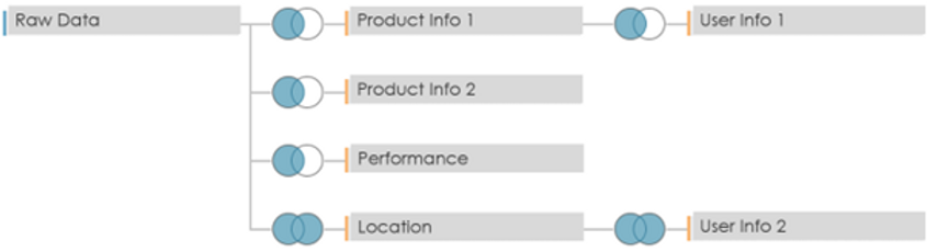
In order to fix these various issues, Argusa completely redesigned the data model. The new model is depicted below.

Where all three components are tables calculated in the database. They are linked using inner joins.
The table Security Rule indicates which access rule is applied for each dashboard user.
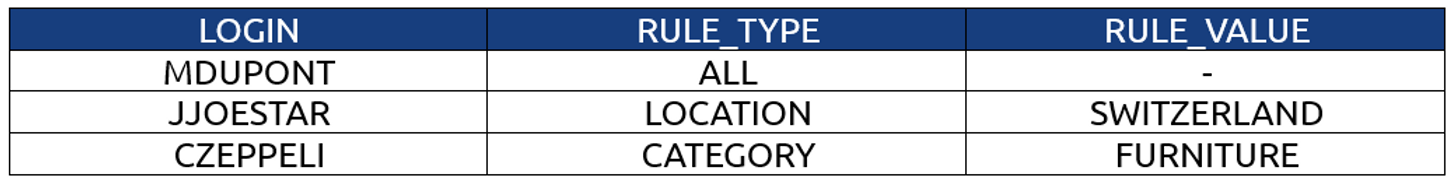
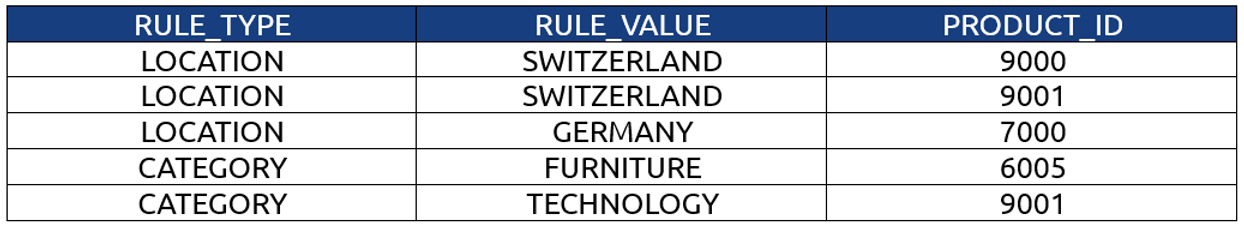
The table Rule-Product Link, as its name suggests, links a given security rule with the id of the corresponding products that can be accessed.
The table Product Data contains the actual data of interest and is a reworked version of the previous model.
The joins on the user information tables are no longer required and the join on the Location table has been swapped from a full outer to a left join.
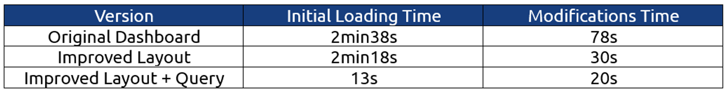
The resulting model only contains 35 native + 43 calculated fields. Additionally, the number of rows of data that have to be accessed is at most 400k, depending on the access rights, which is a 10-fold decrease. This new model only queries the products relevant to the access rights of the dashboard user. Furthermore, the access rules are now centralised in the database and can potentially be dynamic. The initial performance test is reiterated using a user with access to the full dataset. The results are that it takes 13s to do the initial load and 20s to apply all the modifications. As it can be seen, improving the data model had by far the highest impact on performance. The overall performance comparison between the various dashboard versions is given in the following table.
Conclusion
There is a variety of things to keep in mind when designing a dashboard to get the most bang for your buck. Simply choosing the adequate layout for a visualisation can already make a significant impact. However, the key to really squeeze the most performance out of your dashboard is to design your data model in a way that keeps a minimal amount of data.
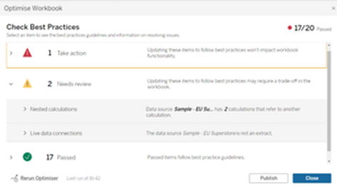
As a final quick tip, note that starting from version 2022.1 Tableau introduced the Workbook Optimizer which reviews the whole workbook and compares its design with the best practice guidelines. While some recommendations should be taken with a grain of salt as they are not always applicable, it is generally a good idea to occasionally run it and check if there is something that could be done to easily improve the performance of the dashboard.
Context
Performance optimisation is a highly common concern in various contexts. In the context of Tableau dashboards, it mainly concerns how much time is needed to do an initial load of the dashboard as well as the time spent waiting when interacting with the dashboard using filters, highlighters, etc. One of our clients with hundreds of dashboards, a large amount of Tableau Prep flows and various Tableau Server sites was running into severe performance issues across the board. The Prep flows were starting to take so much time to run that the server’s resources were starting to reach their limit and many dashboards were so slow that they were becoming impossible to practically use for the business. In order to start helping with these issues, Argusa’s help was requested to optimise a specific dashboard and present general best practices and advice on the topic.
Problem
The dashboard essentially consisted in a list of assets with their related performance metrics with visualisations of the top or bottom 20 performant ones. Various filters and parameters allowed to focus on specific dimensions or metrics. The data source was made of more than 200 fields, with almost a third of them being calculated fields, and more than 4 million rows. There was a large amount of duplication due to the way security was implemented, since the data was sensitive and could be accessed by different kinds of audience. We will expand on that later.
To measure the performance of the dashboard and have a systematic method to perform a comparison before and after our changes, we used Tableau’s handy feature called Performance Recorder.
We measured the time needed to modify two filters and one parameter as well as the initial loading time of the dashboard. The result was that it took 2min38s for the initial load and 78s to apply the modifications. Clearly, it is not the most pleasant dashboard to work with.
Solution
While there is a plethora of factors that can impact the performance of a dashboard, they can be aggregated in two main groups.
- Layout: The arrangement of the elements of a dashboard and the manner in which the underlying visualisations are built.
- Query: The data request and the manner in which the data source is built.
Layout Optimisation
In order to illustrate the case, we have created hereafter a mock dashboard with a structure similar to that of the client. The idea is simply a list of the top 20 products with the highest profit ratio, with the possibility to filter on the type of product or the minimum sales value.
Now let’s dig into the details of how the underlying visualisation has been built.
As we can see, in order to display the top 20 most profitable products a RANK() table calculation (as can be seen from the Δ symbol) was used. This means that Tableau needs to first load all the products, which in the case of our client corresponded to approximately 40’000 rows, in order to subsequently apply a ranking calculation which is then used as a filter to keep only the first 20. The exact same result can be achieved using a smarter way, as shown below.
Here we used context filters on the categories and minimal sales in order to pre-filter the data. Additionally, we used a top N filter on the products. This is a much more efficient way to query the underlying data compared to table calculations, which are always applied last and thus require to load the entire table before filtering it.
Another neat little trick is to use the option “Show Apply Button” on the multivalued filters of the dashboard as this allows to send a single request when performing a multi-select option.
The performance recording of the client’s dashboard before and after the modifications is shown hereafter.
As can be seen, in the original version (top) the time was mainly spent on the layout while on the new version (bottom), time was spent on the query. Time due to the layout was 41.4s before and 1.9s after. Overall, the initial load time went from 2min38s to 2min18s while the interaction time went from 78s to 30s. This is quite impressive as the underlying data model and data source has not been modified whatsoever. Thus, we see that it is worth to give some thought to the way a visualisation is built and not just use the first solution that works.
General recommendations for the layout
Here is a list of general recommendations to improve the performance due to the layout computing.
- Table calculations are usually very slow as they are applied on the resulting view. They should be used as a last resort in case no other way to obtain the desired results is possible.
- If possible, it is best to avoid level of detail (LOD) calculations in favour of standard aggregations as the former are slower to compute.
- A clever use of context filters allows to reduce the amount of data that needs to be subsequently processed.
- In case of duplicated data, use MIN/MAX instead of AVG.
- Minimise the number of elements in a view/dashboard.
- Use the “Show Apply Button” on multi-select filters.
Query Optimisation
Most of the time, performance is mainly driven by the underlying query. This is only natural as the larger the data source the slower it will be to query it. Thus, it is good practice to design the data source with a minimalistic approach. The goal should be to create a data source with the least number of records/rows and dimensions, including calculated fields, that can provide the desired dashboard behaviour and functionalities.
General recommendations for the query
Here is a list of general recommendations to improve the performance due to the query.
- If possible, create a data source with only the required fields in it. Otherwise, hide un-used fields.
- Avoid the use of custom SQL as it limits Tableau’s ability to internally optimise the data request. Especially when sub-requests are present in the SQL query.
- Instead of using dummy calculated fields e.g., to change the display of the name of a field
such as [Client Name] = [People (People)] you can instead:
- Rename the field.
- Use an alias.
- Double click the field
and add “//<alias>”
before the name of the field and press Shift+Enter .
This keeps the original name of the field in the data pane intact
- Avoid unnecessary LOD expressions.
- For joins the performance hierarchy goes as follows: INNER > LEFT/RIGHT > FULL.
- For data types the performance hierarchy goes as follows: Boolean > Float > Date > String.
- Prefer the use of database tables instead of views.
Data model redesign
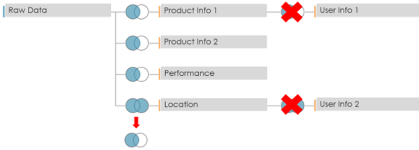
In the case of our client, the main issue stemmed from the data source model which is reproduced schematically below.
The model is relatively complex but more importantly it depends only on custom SQL queries of views. There are various full outer joins which introduce many duplicated lines. The resulting data source is composed of 148 native + 64 calculated fields and more than 4 million rows, many of which are duplicates. The data source was built in this manner to implement security and avoid that the wrong person would access confidential data e.g., based on its location. The security was implemented via a calculated field. Doing it so actually introduces various problems:
- Data Governance is ill-defined.
- Hard to implement and manage when dealing with various workbooks.
- Hard to understand, categorise and evolve the various access rules.
- Necessitates to duplicate data using full outer joins and then using LOD expressions to perform the correct aggregation.
In order to fix these various issues, Argusa completely redesigned the data model. The new model is depicted below.
Where all three components are tables calculated in the database. They are linked using inner joins.
The table Security Rule indicates which access rule is applied for each dashboard user.
The table Rule-Product Link, as its name suggests, links a given security rule with the id of the corresponding products that can be accessed.
The table Product Data contains the actual data of interest and is a reworked version of the previous model.
The joins on the user information tables are no longer required and the join on the Location table has been swapped from a full outer to a left join.
The resulting model only contains 35 native + 43 calculated fields. Additionally, the number of rows of data that have to be accessed is at most 400k, depending on the access rights, which is a 10-fold decrease. This new model only queries the products relevant to the access rights of the dashboard user. Furthermore, the access rules are now centralised in the database and can potentially be dynamic. The initial performance test is reiterated using a user with access to the full dataset. The results are that it takes 13s to do the initial load and 20s to apply all the modifications. As it can be seen, improving the data model had by far the highest impact on performance. The overall performance comparison between the various dashboard versions is given in the following table.
Conclusion
There is a variety of things to keep in mind when designing a dashboard to get the most bang for your buck. Simply choosing the adequate layout for a visualisation can already make a significant impact. However, the key to really squeeze the most performance out of your dashboard is to design your data model in a way that keeps a minimal amount of data.
As a final quick tip, note that starting from version 2022.1 Tableau introduced the Workbook Optimizer which reviews the whole workbook and compares its design with the best practice guidelines. While some recommendations should be taken with a grain of salt as they are not always applicable, it is generally a good idea to occasionally run it and check if there is something that could be done to easily improve the performance of the dashboard.